
Start With the House, Not the Board Rack
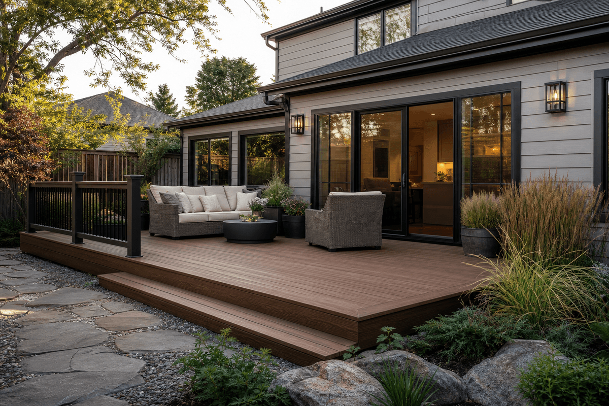
Wood look composite decking can be remarkably convincing, but realism alone does not guarantee a good design. A beautiful board can still feel out of place if its undertone argues with the siding, its grain is too rustic for the architecture, or its darkness turns a small shaded deck into a heavy visual block. The better starting point is the home itself.
Stand at the main door to the deck and identify the colors already present: interior flooring, window frames, trim, masonry, roofing, and major landscape materials. Then use the composite deck color guide, decking and flooring options, wood and composite deck comparison, deck board sizing guide, and Composite Deck Pro to build a shortlist that supports those fixed elements rather than competing with them.
Match Undertones, Not Exact Colors
Trying to match exterior materials exactly often produces an uncanny result. A nearly identical brown beside brick or timber can expose small differences and look accidental. Coordinating undertones is more forgiving. Warm brown decking works naturally with cream, tan, red brick, and bronze details; cooler brown and taupe can bridge gray siding, stone, and black metal.
Interior flooring is a useful clue but not a command. The deck can continue the indoor color temperature without copying the same shade. That creates a smooth visual transition through glazed doors while allowing the outdoor surface to handle stronger light, dirt, leaves, and weather without appearing like an extension that tried too hard.
Choose the Character Level Your Architecture Can Carry
Wood-look products range from quiet, linear grain to highly varied boards with knots, cathedral patterns, and strong streaking. Neither end is automatically more authentic. The right amount of character depends on the building and the size of the deck.
- Modern homes usually benefit from long, restrained grain and limited contrast.
- Craftsman and traditional exteriors can support warmer color and more visible variation.
- Small decks often feel larger with calmer, medium-light boards.
- Large open decks can use stronger variation without becoming visually crowded.
- Busy masonry or patterned siding calls for a quieter deck surface.
Let Borders and Stairs Do the Framing
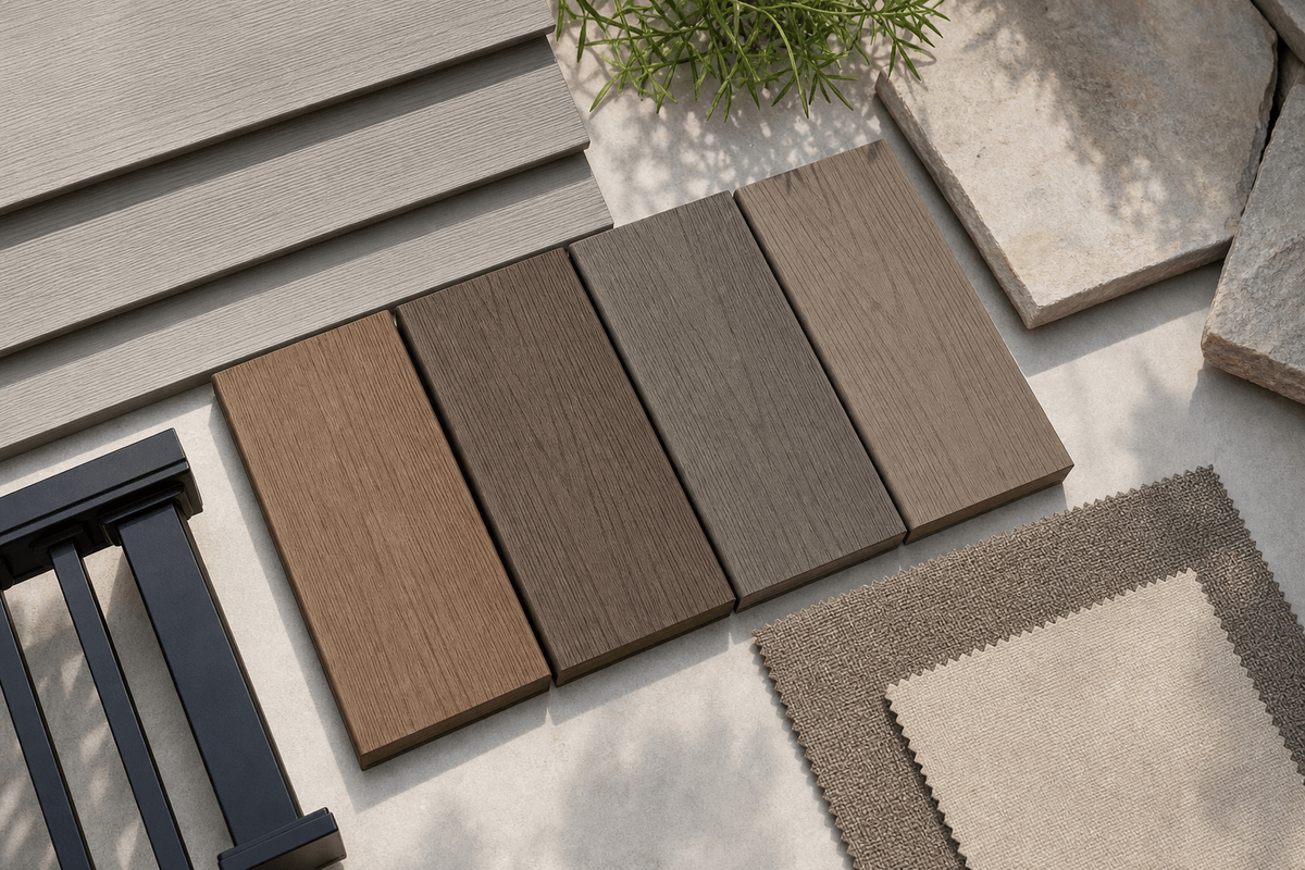
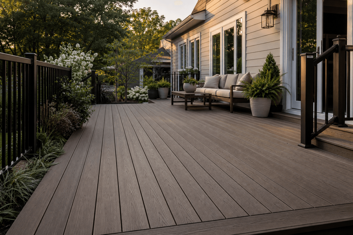
A second color is most effective when it has a job. Dark picture-frame borders define the deck perimeter, help organize changes in board direction, and can connect visually with black railings or window frames. Contrasting stair treads make level changes more legible, while coordinated fascia keeps the edge from looking unfinished.
Avoid adding contrast to every available component. If borders, stairs, fascia, railing, and built-in benches all change color, the deck can become fragmented. Pick one field color, one supporting accent, and repeat the accent only where it clarifies structure. The composite decking installation guide helps connect these visual decisions to practical board planning.
Use Landscape Colors as the Seasonal Layer
Plants shift through the year, so decking should provide a stable background. Medium wood tones are especially flexible because they sit comfortably beside summer green, autumn orange, winter bark, and spring flowers. Gray-brown boards can work well in contemporary gardens with stone and ornamental grasses, while reddish boards need more care around red brick or strongly colored mulch.
Furniture and textiles can supply the colors you may want to change later. A neutral wood-look deck can carry blue cushions one season and rust or olive the next. This is generally more adaptable than choosing a highly fashionable deck color and asking every future furnishing decision to cooperate with it.
Do a Full-Sized Mockup Before Ordering
Place at least three boards together near the house, ideally including the intended border color. Look from inside, from the yard, and from neighboring rooms that overlook the deck. Check the grouping in direct sun and shade. One board cannot show the color rhythm or the way seams and grain direction will read across a wider field.
Dark colors can absorb more heat, so exposed sites deserve an extra comfort check using the decking for full-sun spaces and heat-resistant decking guide. Also review cleaning expectations through the low-maintenance decking overview; pale dust, pollen, muddy footprints, and pet hair show differently on different tones. A good palette needs to work on an ordinary Tuesday, not only in a styled photograph.
Design for a Relationship, Not an Imitation
The most successful wood look composite decking does not pretend the entire project is made from one material. It borrows the warmth and visual rhythm people value in timber, then coordinates that character with the home's architecture and a lower-fuss outdoor routine. Start with undertones, control the amount of grain, use contrast purposefully, and test several boards together. If the palette still feels uncertain, contact Composite Deck Pro with photographs and project conditions before settling on the final combination.